


Effective data-visualisation in three steps

Picture it: you’ve rounded off your last online meeting of the day and collected all the necessary data to impress the boss. Time for one last coffee before thinking carefully about the message you want to communicate. But how can you get that message across? Without discussion; or perhaps that’s exactly what you want? And how best to live up to expectations? The answer: data-visualisation, which can really be a boon to effective communication. ITDS consultants Rinaldo and Noah reveal three steps that will help you visualise your data and get that message across, loud and clear.
The importance of data visualisation
Nowadays, businesses simply have to keep up with the ongoing digitalisation of society and increase their focus on data-driven working. The advent of Bigtechs and the increasing use of AI applications actually make it easier (AFM, 2021). The market position of a financial services provider can exploit and convert this trend into an opportunity that brings competitive advantage. But how exactly can you work in a more data-driven manner?
One way of doing so is the visualisation of your data. Now while this might seem like a no-brainer, in the real world it can often be difficult because of today’s sheer volumes of data. Visualising data, however, can help transform it from a maze into a clear path. And it will create value for your organisation too, by facilitating and stimulating a discussion about the content of the data. You’ll avoid situations in which a difficulty to correctly interpret data means that ensuing discussions are largely based on assumptions. And enable you to make decisions that are based on facts, not interpretations. To visualise your data effectively, follow the three steps outlined below.
Step 1: Establish what you need to do
The way that you visualise the data must be tailored to the target audience. In a presentation, for example, you might want to use data to prove a hypothesis or describe a process. If you want to prove a hypothesis, it will be important to emphasise values, trends and/or correlations. Supposing, for example, that you want to demonstrate to the management that turnover is stagnating because of Covid-19, you’d opt for visualisation that shows a trend. Or, if you are a sales manager who wants to measure the performance of your sales team you’d visualise data by showing exact values.
A further option is to illustrate a process or step-by-step plan. Visualisations like these focus on explaining complex ideas and they are often used when making recommendations to a client. Examples include tree diagrams and matrices.
Step 2: Define your message
The second step is defining your message. To avoid discussions or, conversely, to stimulate them, it’s crucial to stress what your message is. The importance of doing this is illustrated by the following example, in which you want to show the management which country offices are failing to hit the agreed target.
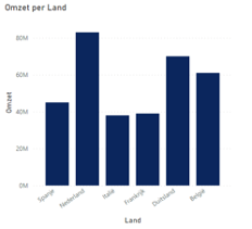
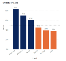
Both charts show the same information. However, in the chart on the right, perspective that’s based on the need, or the objective of the message, has been introduced. Doing this will also avoid confusion about how the data is interpreted. In the chart on the left, for example, it’s difficult to see the difference in turnover between Italy and France, and it’s not easy to quickly establish which countries failed to hit the target. But in the chart on the right it’s much easier to see which countries failed to hit the target, as well as the respective values of all the countries’ results. If your visualisation focuses on the need, your message will be clearer
Step 3: Choose the right form of visualisation
When you opt for a certain form of visualisation, it’s important to accentuate the relationship that you want to illustrate. Below, for example, is a visualisation of the composition of an investment portfolio.
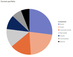
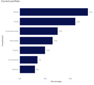
In the chart on the left you can see that the portfolio comprises several investments, but it’s very difficult to ascertain the respective proportions and percentages. Contrast this with how the chart on the right has been visualised. It clearly shows the proportional relationships between the investments and the respective percentages. This clearly demonstrates that each form of visualisation has a different result and thus conveys a clear message when presented.
Invest time and effort in your visualisation
If you think carefully about your target audience, the message and its visualisation, it will all help to get your message across. The value of visualisation is often underestimated, but here at ITDS experience has taught us that it really can help in getting your message across to your target audience.
Want to know more about our experiences with data visualisation or data management? Get in touch with Rinaldo at r.dejager@itds.nl or Noah at n.degroot@itds.nl.