


CRITICAL ANALYSIS: LESSONS LEARNED FROM THE CORONA DASHBOARD

To give them better insights into their data, organisations are increasingly making use of dashboards. And why not? A dashboard is an excellent tool for improving performance. That said, it is also important that you are aware up-front of the potential pitfalls. ITDS develops dashboards for its clients. Drawing on his experience, and using the by-now infamous corona dashboard as an example, Berry Versmissen gives a few tips on how to avoid the pitfalls.
Pitfall 1: Too much information
A good dashboard shows all the important information, at a glance. However, if too much information is presented, chances are the dashboard will hardly be used or even not used at all. To avoid such a situation it’s important to start by defining the objective, the user (groups) and the business requirements. Based on this, you can decide which KPIs need to be included, not forgetting to differentiate between “need to know” and “nice to know”. An erroneous KPI, a KPI that you cannot influence, or a KPI for which you ignore the results could be disastrous. And that’s exactly what we saw with the corona dashboard.
The corona dashboard
The corona dashboard made no distinction between different groups of users. All the available information was shown in the dashboard. An example of this is a sewage-water measurement that gave insight into the average number of virus particles per 100,000 residents. While it’s true that this insight provided relevant information that could certainly be used by the RIVM (Dutch National Institute for Public Health and the Environment), for example, it was not relevant for every dashboard user. Therefore, this KPI need not have been visible to everyone. Mapping the preferences, requirements and relevance of information per user group, makes it easier to select the right KPIs. This will avoid an overload of (sometimes irrelevant) information being presented in a dashboard.
Pitfall 2: Incorrect or incomplete data
The harvesting of reliable data is an essential part of the development of a dashboard. But before the harvested data can be used, it must be readied for use, which means it has to be reviewed, cleansed and suitably prepared. If data is not properly made ready it can lead to incorrect or incomplete data being used. And this can create a false reflection of the reality. The latter was also the case with the corona dashboard.
The corona dashboard
The corona dashboard repeatedly gave a false indication of the number of new corona infections, differing from the numbers given in other dashboards, including that of the RIVM. The dashboard was also susceptible to malfunctions. As a result of these malfunctions, infection numbers were not generated and processing of the number of new infections was delayed. It meant that the dashboard was often not up-to-date and was not providing the correct insights into the prevailing situation. Proper preparation of the data could have prevented these numerical discrepancies. By deleting erroneous data, supplementing missing data and choosing a fixed update frequency, the use of incorrect or incomplete data would have been avoided.
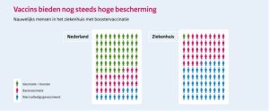
Pitfall 3: Incorrect or too many visualisations
Once the data has been harvested, it’s important present it as accurately as possible. This is achieved through the use of visualisations. It’s a fact that we are better at processing and remembering images than text. Providing, of course, that the visualisation supports the message and shows the relevant data clearly. If not, it will raise more questions than it answers and cause confusion. All-too-often nowadays, a “fancy” visualisation is chosen. Resist this temptation and make sure that your message is communicated effectively by a simple, unambiguous visualisation. This will ensure you won’t miss the mark completely, like the visualisation below did.
The corona press conference
During a press conference in January 2022 there was confusion because of a visualisation that was supposed to emphasis the importance of vaccinations and boosters (see the image below). The message that the visualisation was supposed to communicate is that having a booster will reduce your chances of having to be admitted to hospital. Unfortunately, this is not immediately obvious in the visualisation. The way the data is displayed is not clear. While the use of human icons may look cool, their depiction doesn’t get the message across effectively. It would have been better, for example, to use a simple pie chart, with the associated percentages. This would have avoided the confusion and ensured that the visualisation actually supported the message.
Legend for visualisation
| NL | English |
| Vaccins bieden nog steeds hoge bescherming | Vaccines still offer a high degree of protection |
| Nauwelijks mensen in het ziekenhuis met boostervaccinatie | Hardly any people with booster vaccinations in hospital |
| Nederland | Netherlands |
| Ziekenhuis | Hospital |
| Vaccinatie + booster | Vaccination + booster |
| Basisvaccinatie | Basic vaccination |
| Niet (volledig) gevaccineerd | Not (fully) vaccinated |
Pitfall 4: No call to action
Having chosen the KPIs, prepared the data and designed the visualisations, what’s needed next is a call to action. The objective of a dashboard is not only to offer insights, it must also stimulate the associated actions. However, insights that trigger the wrong actions, or fail to trigger an action at all, will cause problems and lessen the use of the dashboard. So make sure you share information on the dashboard that stimulates the appropriate and desired actions.
The corona dashboard
In the case of the corona dashboard, it was debatable whether the visualisations actually stimulated users to take action. Truth be told, it mainly presented users with a lot of text supported by visualisations, but it didn’t call to any action. There were no threshold parameters showing a minimum or maximum at which action should be taken. It was a missed opportunity that could have made the reinforcement or relaxation of the corona measures more predictable. You could think here along the lines of the maximum number of infections after which a measure must be introduced or re-introduced. By setting minimum and maximum limits to a KPI and then linking these to the appropriate actions, there will always be a stimulus to proactively do something.
More knowledge and better decisions
“We have to base 100 per cent of our decisions on 50 per cent of what we know,” said Prime Minister Mark Rutte about the coronavirus. Hardly an ideal situation! Had the potential pitfalls of developing the corona dashboard been taken into account, better insights could have been generated. This is why it’s so important to choose the information and visualisations carefully, properly prepare the data and thus eventually ensure that the insights that are provided stimulate the appropriate actions. A retrospective look at the corona dashboard perfectly illustrates why it’s always a good idea to try to avoid these potential pitfalls. The dashboard that you can then develop will provide the right insights to help you improve the performance of your organisation.
If you’d like to know more about avoiding these and other potential pitfalls in the development of your dashboard, get in touch with Berry Versmissen at b.versmissen@itds.nl or Robin Verkerk at r.verkerk@itds.nl